
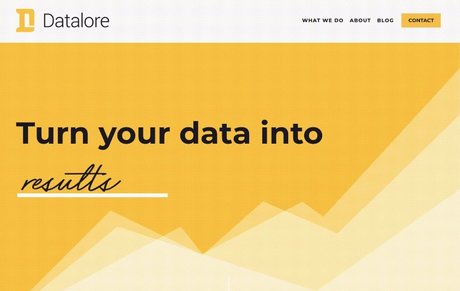
Datalore
WEBSITE AND DESIGN
Datalore offers an incredibly valuable service: the ability to understand what’s going on.
They are wizards with Power BI, and use data visualization to find unseen opportunities. Unfortunately, it can be hard to have that conversation with folks, since it’s extremely easy for that conversation to get deep into the technical details in a hurry.
They approached us looking for a way to quickly and beautifully explain the power of their offering.
“We needed a way to talk about data, without actually talking about data.”
— Josh Whiting, Creative Project Lead
Solutions
Large, Conversational Headlines
Their customers have varying levels of technical familiarity with data visualization. We need to keep it casual (and skimmable), so everyone feels included in the conversation.

2. Interesting, Simple Charts + Graphs
Raw data and information is overwhelming. Sometimes it looks more daunting than the actual problems you’re trying to fix. For this reason, we wanted to provide a visual cue for what it’s like to work with experts like the Datalore team. Once you bring a guide and technical whiz into the equation, problems evaporate and solutions become evident.
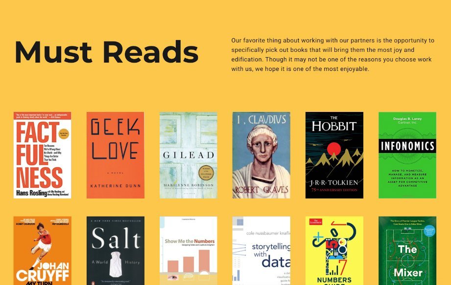
3. Keep it Fun
People like to work with people, not sterile brands. For this reason, we felt it made sense to let some of Barrett and Christina’s personal side shine, namely, their love of books. You want someone smart (and delightful) in your corner, and this section of the About page gives a quick taste of both.
“PowerServe quickly understood the complexities of our business and the specific needs we had for our website. Enhancing our ability to communicate what we do to our clients was a critical factor in the growth of our company.”
— Barrett Layman, Datalore